Food Rescue App
The Project
The Food Rescue App project is a mobile application designed to address the problem of food waste and hunger by connecting food donors with local charities and food banks. The app will allow individuals and businesses to easily donate excess food that would otherwise go to waste, and enable charities to efficiently and effectively distribute that food to those in need.
The Problem
Food waste is a significant problem worldwide. In the United States alone, it is estimated that up to 40% of the food produced is wasted. At the same time, millions of people suffer from food insecurity and do not have access to enough food to lead healthy, active lives. The Food Rescue App project aims to address both of these problems by providing a platform for individuals and businesses to donate their excess food to those in need.
The Goal
The goal of the project was to design and develop a mobile application called “Food Rescue” that allows users to easily locate and rescue surplus food from local restaurants, grocery stores, and events. The objectives were to create a user-friendly and visually appealing interface, streamline the process of food donation and pickup, and reduce food waste in the community.
My role
As the UX UI Designer, my role was to lead the design process from start to finish.
Responsibilities
I collaborated with the product manager, developers, and stakeholders to define the app’s features and functionality. I conducted user research, created personas, designed wireframes and mockups, and performed usability testing to ensure an intuitive and efficient user experience.
Tools

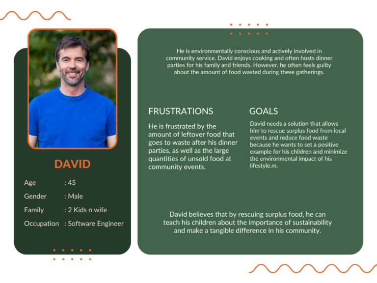
Persona 1 - David
David needs a solution that allows him
to rescue surplus food from local events and reduce food waste because he wants to set a positive example for his children and minimize the environmental impact of his lifestyle. David believes that by rescuing surplus food, he can teach his children about the importance of sustainability and making a tangible difference in their community.
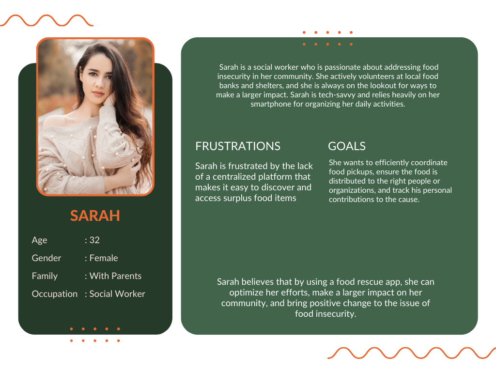
Persona 2 - Sarah
Sarah is a socially conscious individual who needs a food rescue app that connects her with local restaurants, grocery stores, and events with surplus food. She wants to streamline the process of food donation and rescue because she
recognizes the urgent need to reduce food waste and provide nutritious meals to those in need.
Starting the design
Digital Wireframe
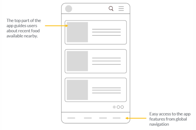
During the wireframe design phase of the Food Rescue app, my goals were to create a user-friendly interface that made it easy for users to navigate and access the app’s various functionalities. My thought process involved considering the user’s journey and incorporating their feedback from our earlier user research phase
Low Fidelity Prototype
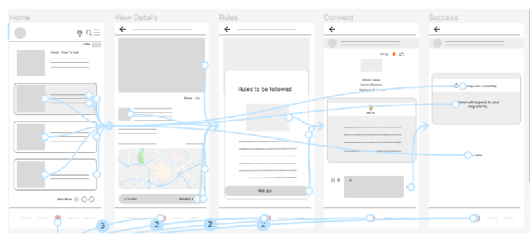
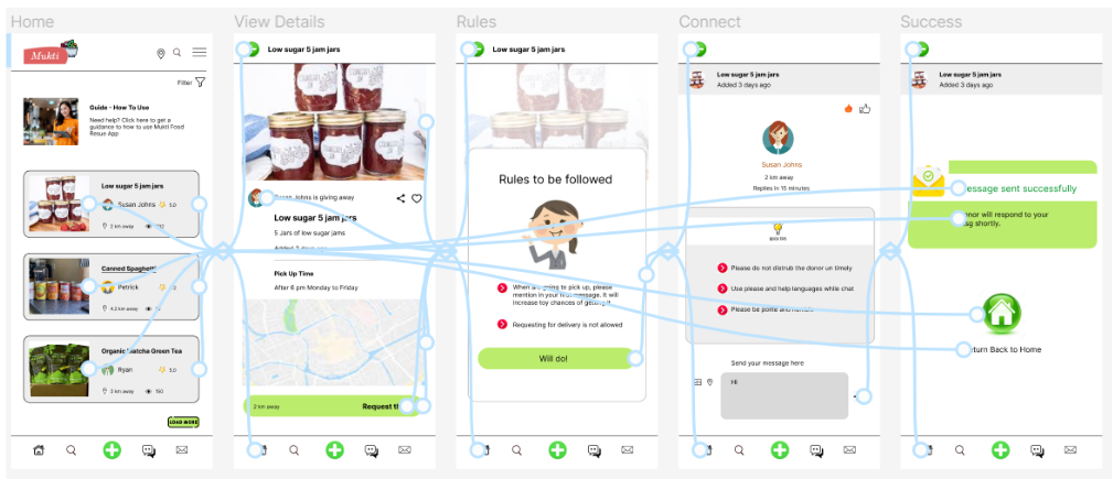
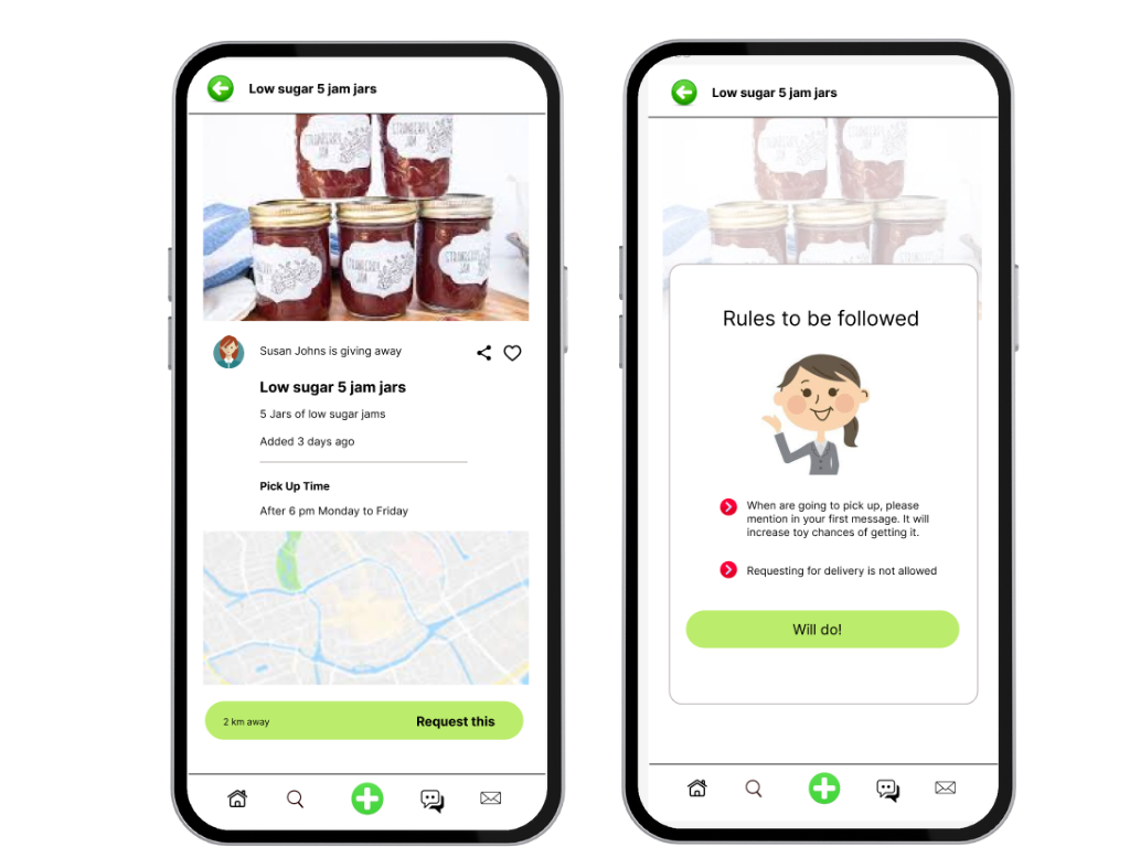
Prototype of Food Rescue app showing how users view the listing of all items available near their location.
He clicks on one item and checks the location and small details of the donor.
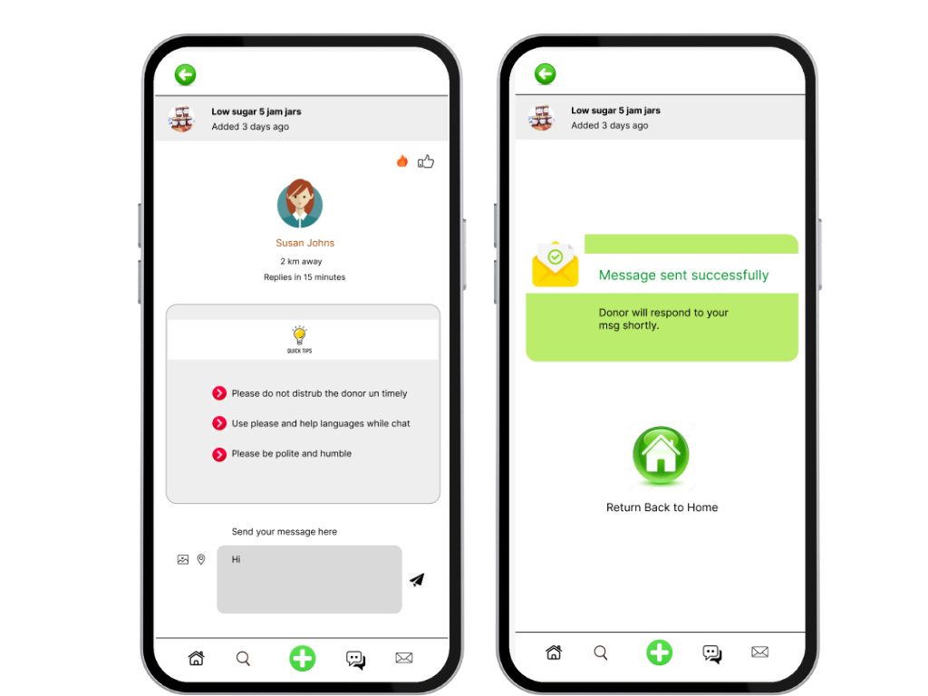
Then he clicks on Connect Donor and gets to see the rules.
Users connects to donor and check instructions before connecting, which takes care of privacy.
Usability Study
Study Parameters
The 60-minute food rescue app usability research had 5 participants. Participants freely explored the app and provided usability feedback. The study’s findings will help improve the food rescue app’s usability and efficacy.
Study Type
Unmoderated Usability Study
Participants
5 Participants
Length
30-60 minutes
Study Findings
Finding 1
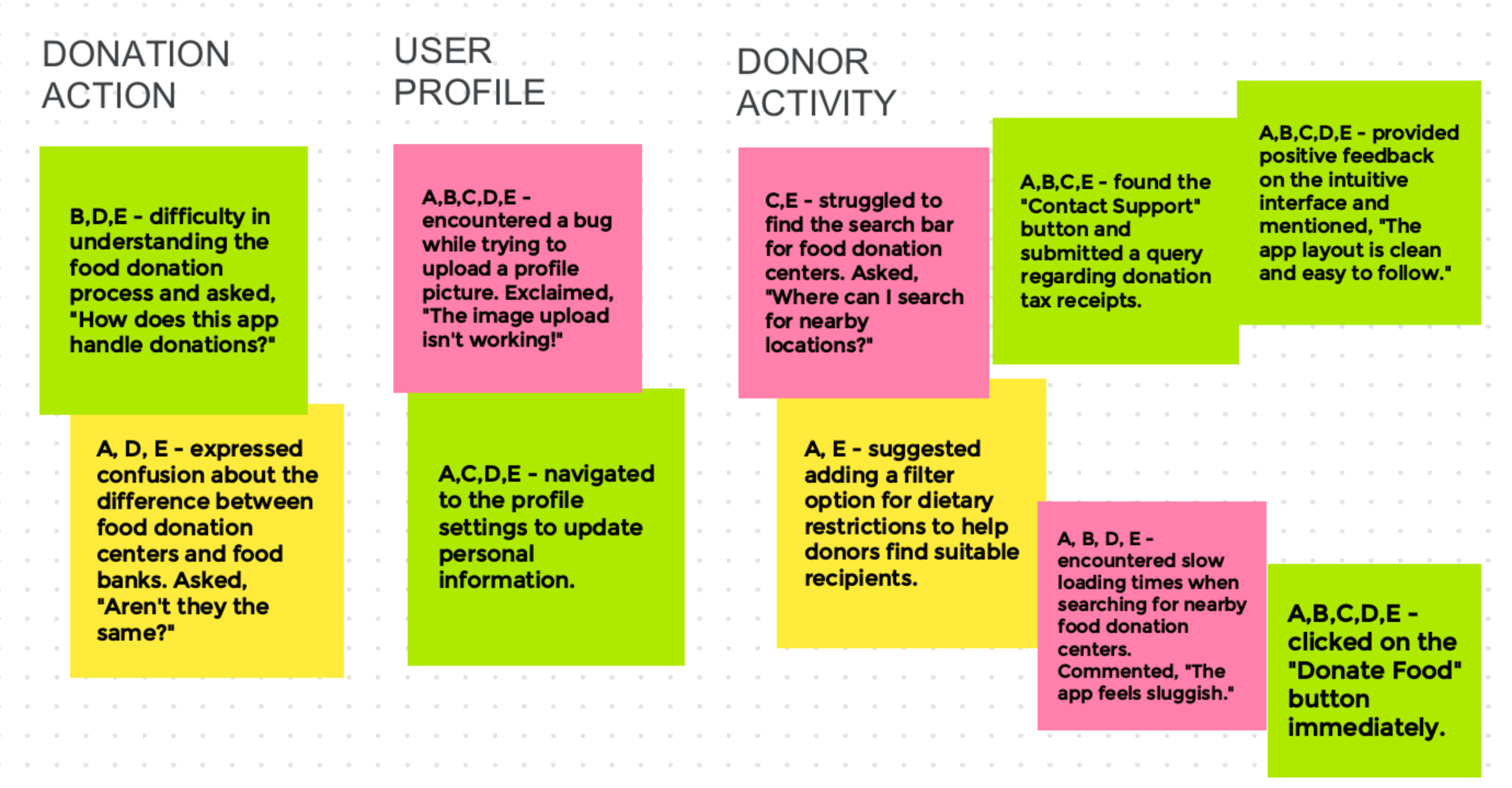
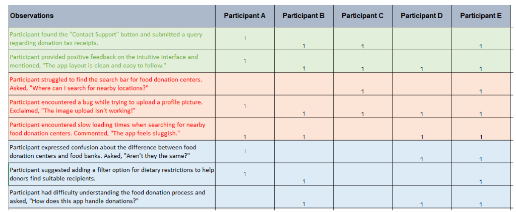
Participants had difficulty finding the search bar for food donation centers, indicating that the search feature may not be prominent or easily discoverable.
Finding 2
Participants experienced slow loading times when searching for nearby food donation centers, leading to a perception that the app is sluggish.
Finding 3
Participants expressed confusion about the difference between food donation centers and food banks, indicating a lack of clarity in the app's terminology or information.
Affinity Diagram
Usability Study Chart
Refining the design
Sitemap
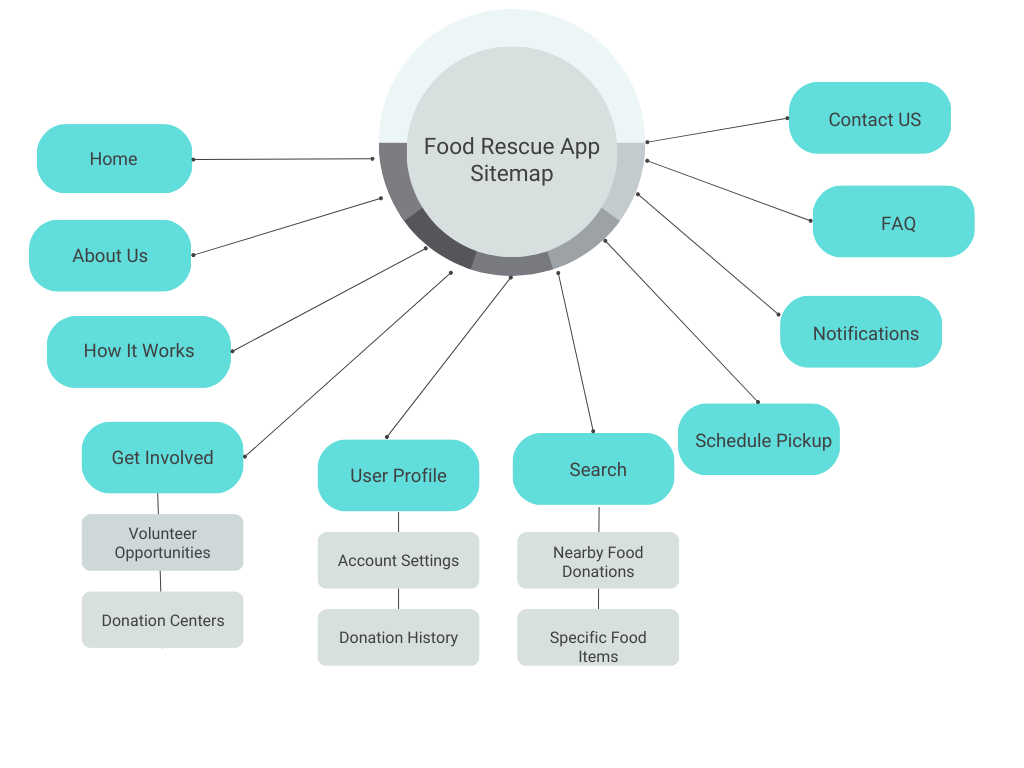
With this sitemap ready, we started with the final design as all linking is clear now.
Wireframes And Prototypes
Figma is used for both Wireframe and Prototype creation.
Prototypes
Figma Link :
Low-fidelity prototypes followed the same user flow as the low-fidelity prototype, including design changes made after the usability study.
Mockup
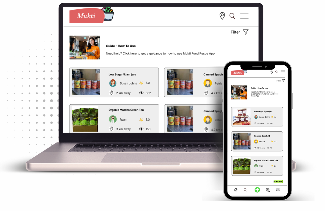
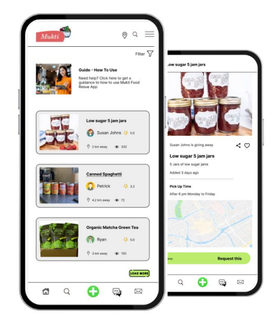
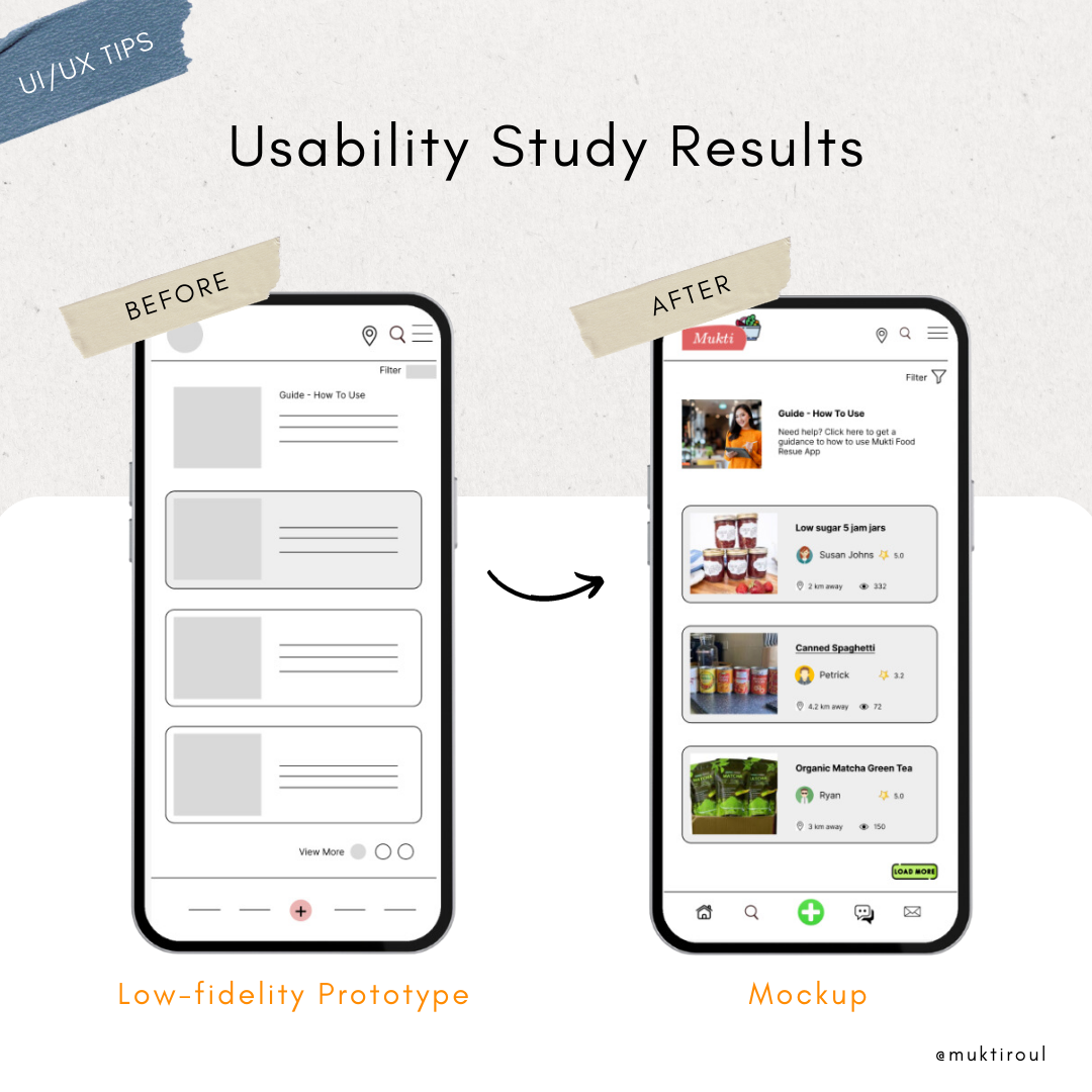
Our goal was to give clarity to users to how to use this app. So added Guide section on the top.
User was confused how can he become donor and add his items, so given + sign prominently on the bottom navigational bar.
Added filters on top navigation to make it more user friendly.
Accessibility Considerations
Our app for food rescue was meticulously designed with accessibility considerations in mind, ensuring equal access and usability for individuals with diverse abilities.
We ensured that there was sufficient color contrast between text and background elements to improve readability, making it easier for users with visual impairments to navigate the app.
The app utilized legible and scalable fonts with appropriate sizes to accommodate users with varying visual abilities. We avoided using decorative or complex fonts that could hinder readability.
We provided alternative text descriptions for all images used in the app. This enables users with visual impairments to understand the content and context of the images using screen readers.
Final Responsive Design
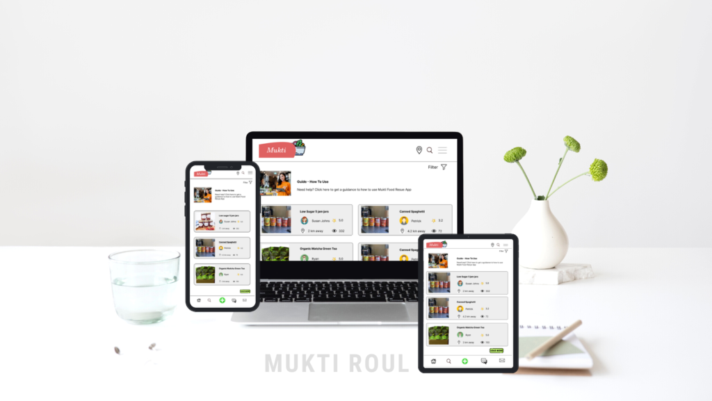
The design for screen size variation included mobile, iPad, and desktop. We optimized the designs to fit the specific user needs of each device and screen size.
